

Backstage with Matthew: The Opera House in 154 Million Data Points
Design: Tal Rosner (projections) and Justin Partier (lighting) (Photo by: Matthew Washburn)
I wanted to share with you what it took to get to this point. How did we create projections with fidelity to the architecture of one-half inch? I sat down with our Technical and Safety Director Erik Walstad who has been working tirelessly to make possible this extraordinary projection capability.
Erik Walstad, Technical and Safety Director at San Francisco Opera
Once we decided that we wanted immersive projections in the auditorium, our production team set to work to make it a reality. Erik knew that we would need to digitally map the auditorium, but this was a process new to the company. He turned to local company Meridian Survey in May 2024 to undertake a LiDAR scan of the auditorium. LiDAR stands for Light Detection and Ranging and it’s a form of surveying that emits pulses of laser light and measures the time it takes for a pulse of light to reflect back to the sensor. As the sensor pans across the building, a digital 3D map is created of every surface. The process of scanning the auditorium took sixteen different scans over the course of two days. Constant during each scan are fixed-point spheres which become reference points for the LiDAR scan. As long as three spheres are visible in the scan, the scanner knows exactly where it is in the 3-dimensional space. You can see some of the spheres set up in the image below, these on the Grand Tier/Dress Circle level.
Each moment of light reflection becomes a data point and, when aggregated, the data points create a three-dimensional image of the auditorium that can be viewed from any angle and any direction. Once the scan has measured the light points, it then also creates more traditional images with a digital camera. When those regular images are overlaid on the light points, the scan assigns a color to each data point, resulting in an image that looks eerily like a photo but in actuality is a data map. In the case of the auditorium, it is a data map made up of 154 million light reflections or data points! To give you an example of what it looks like, here is the same shot above seen through the digital map:
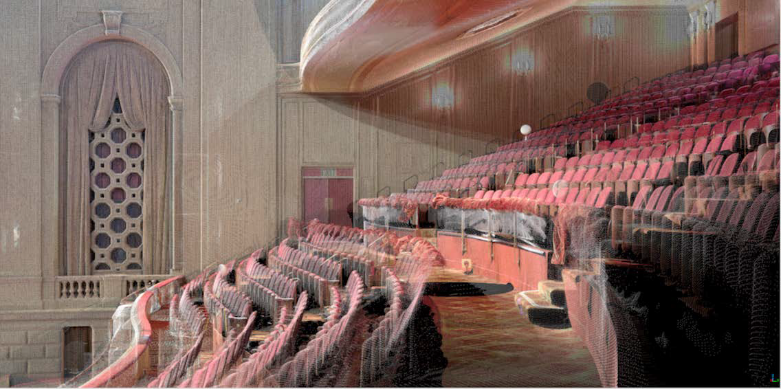
Part of the LiDAR scan of the grand tier and dress circle.
That’s pretty amazing! A fully 3-D map of every nook and cranny of the auditorium! Technically it means that you can project onto any one of those 154 Million data points with absolute precision. Easy, right? Well, no – the LiDAR scan is just the first stage in a long process. The next, much more complex step, is to create a usable model of the Opera House, utilizing the data points, but streamlining them to usable guides for the projection design.
For years, Erik has created and utilized models of the theater in the Vectorworks software. It allows us to overlay technical plans of productions from other theaters into our space and look at the fit of the production on stage but also examine the sightlines of something on stage from different locations in the house. Here’s an example of a sightline study Erik created in March 2024 as we worked with our friends at Opera Australia to make adjustments to the production of Idomeneo recently on our stage.
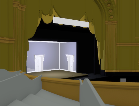
A sightline study for Idomeneo using Erik’s older Vectorworks modeling.
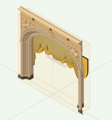
The kind of fidelity in this earlier modeling is excellent for sightline studies, for studying set placements on our stage, working out lighting positions, fly tower space, etc. But the kind of model needed for projections is a very different story. To do the kind of projection mapping that we saw at the Pride Concert, we needed to create a usable map for our designer, Tal, accurate to the smallest architectural detail – down to the half inch. That’s how big the pixels are on the surface.
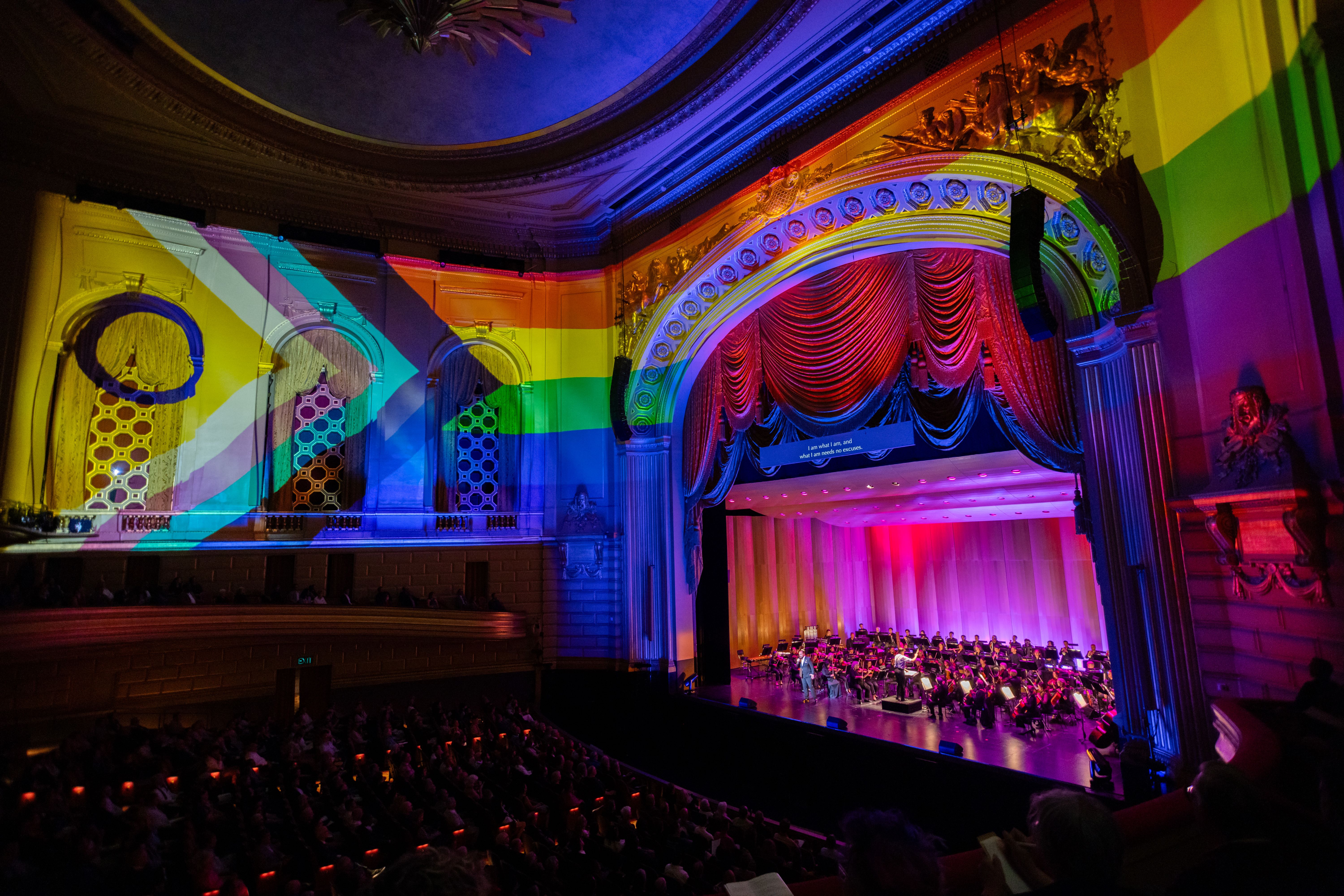
As an example of how critical that accuracy was to the projections at the Pride Concert: one of Tal’s projections during “I Am What I Am” from La cage aux folles, created an extraordinary effect. He essentially projected the gold walls onto the actual gold walls so it looked like there was no projection. As the song builds in intensity, the projected gold walls start crumbling away, revealing the Pride flag underneath! If the projections were even a half-inch off, the effect would not have worked.
Design: Tal Rosner (projections) and Justin Partier (lighting) (Photo by: Matthew Washburn)
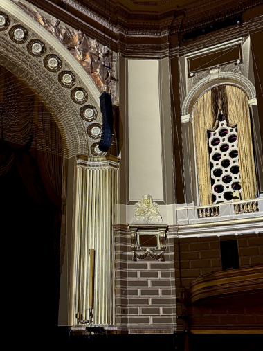
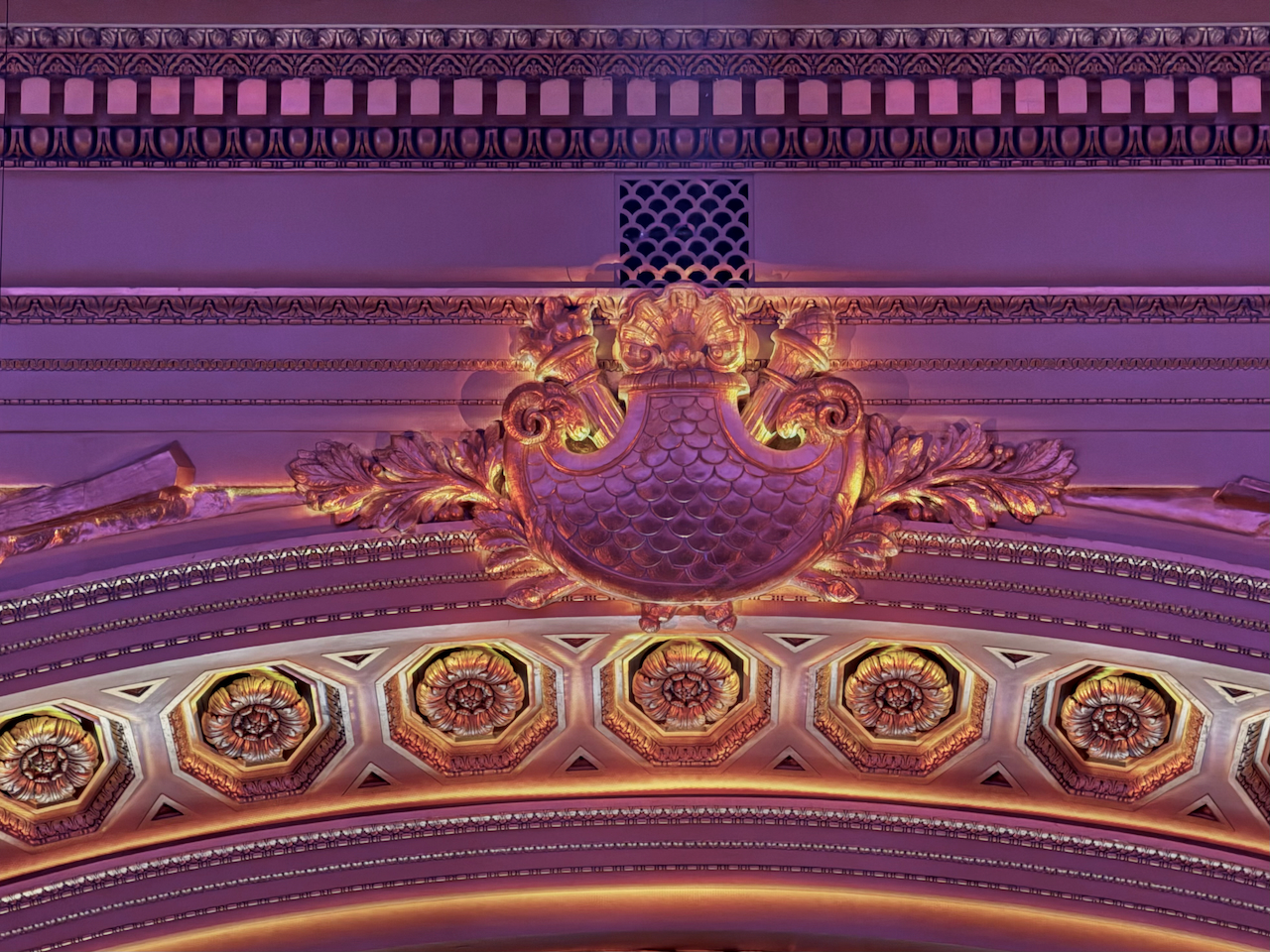
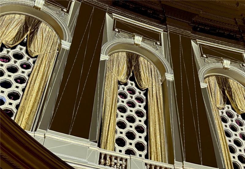
You can see the fidelity of the projections to the architectural detail on the next image, where projections light up the detail, brick by brick, rosette by rosette, column flute by column flute. It is an exact overlay of the architectural detail. This is all lit with projections; there are no lights being used here.
(Photo by: Matthew Washburn)
So, you might ask, can we just get the blueprints to the building and feed them into the Vectorworks software? Sadly, once again, the answer is not that straightforward.
The Opera House was built almost a century ago in 1932. Now while much of the design is incredibly accurate, there are many things in the blueprints that don’t conform as you would hope or expect – there are tiny inconsistencies that don’t change the integrity of the building in any way, but make this kind of projection mapping very tricky. The symmetry of the building can be off between both sides of the house; certain angles have shifted as with any older building and subsidence; and there is not the kind of consistency you might expect between architectural details, for example the gold bricks on the wall or the octagons that make up the organ bays.
Erik found 30 different sizes of bricks used on those gold walls, randomly arrayed based on the sweep of the wall, the doorways, etc. He had to model each brick separately. The same for the organ bays – each of those six panels is different, as are the swag curtains there. Step by step Erik had to model each component part of the Opera House, using the 3D map to create a model with absolute fidelity to the actual architecture. Here’s the segment of the proscenium arch in Erik’s new model.
Erik had to decide how much detail would be needed for this model. It would technically be possible to create a model using all 154 million data points, but that would take a vast amount of time, and it would lead to a model so vast in size and so cumbersome to use that it would be counter-productive. As a result, Erik worked with Tal to determine what areas were really needed for the projection mapping. For example, we didn’t need to model of each seat in the Opera House. Erik focused on the details that really mattered, and those details took some very nuanced mapping.
Take the detail of the proscenium arch, particularly the two horses and their riders, and the crest at the top of the proscenium. We wanted the ability to project onto those features and it was worth taking the time to map that detail from the LiDAR scan. The scan gives the depth of each datapoint and, with Vectorworks, Erik joins the depths of each datapoint in a series of triangles to create a ‘mesh’ contour map of the surface. That mesh can then be incorporated into the model, allowing us not only to project onto the outline of the horses or the crest, but into the contours of those shapes as well. The four images below show the progression from the data map, to the mesh contour, to the final digital model of the crest, to the projections highlighting the specific architectural detail.
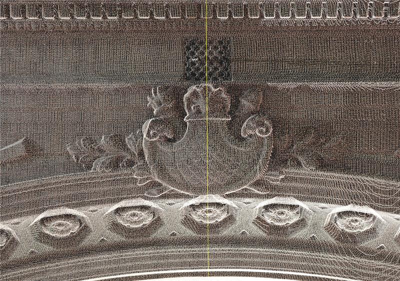
The LiDAR scan of the proscenium crest.
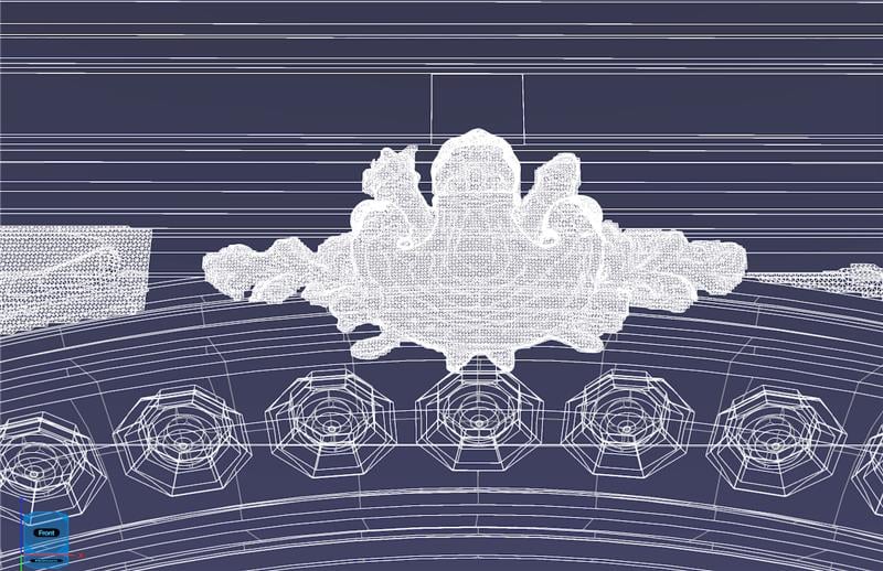
The mesh version, joining together the contours of the crest using thousands of triangles.
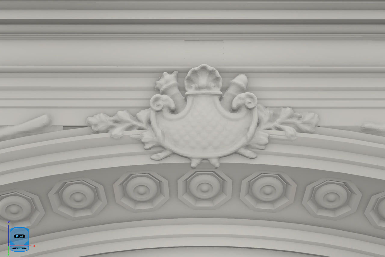
The crest as incorporated into Erik’s model, utilizing the mesh map above and then clothing it in a surface.
A projected image onto the crest, showing the level of fidelity to contours of the crest. Design: Tal Rosner
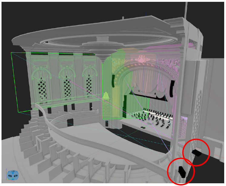
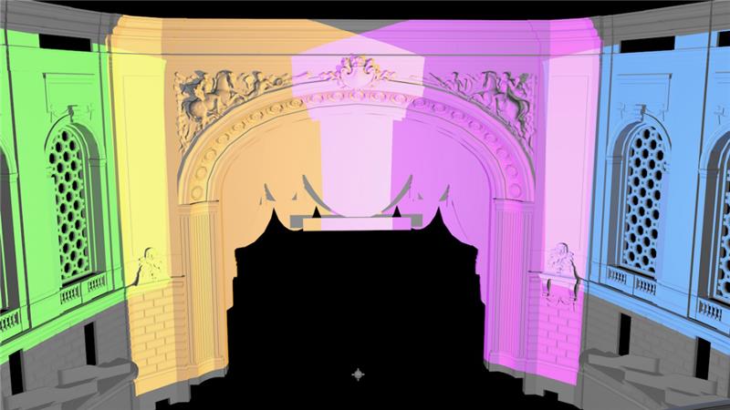
Once Erik had finished the model, he and Tal then worked to determine the number and position of projectors that would allow us to cover the front and side walls of the auditorium. The model allowed us to translate back and forth between our modeling software and Tal’s design software. From this we determined that the auditorium projection surface could be covered with just four projectors, placed in the farthest organ bay on each side of the theater. The first image below shows two of the projectors on the house right side organ bay and what they are able to cover on the opposite side of the auditorium. The second image shows the full coverage of the house zoned by the four projectors, each represented by a different color.
With the model complete and the projector study proving full coverage of the theater, early projector studies then helped determine if there were any anomalies. There was only one. The curtains in the organ bays were swagged a little higher than in the first pass of the model – you can see this on this model image:
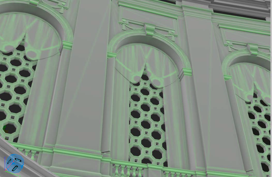
With a quick adjustment, Erik reset the bottom of the curtain swag, and the projections lined up perfectly as in the image below. Everything else lined up perfectly first-time around!
The level of fidelity possible with this intricate mapping is breathtaking. Take the following photo as an example. This is an example of where the projections can be used to create the illusion of lighting. As you can see in the photos, there is a strong up-light evident to give a striking, dramatic feel – you can see it on the ‘comedy’ mask at the bottom left corner of the photo and the scrolls at the top of each of the organ bays. There is no way we could accomplish that with lighting, particularly the organ bays, as there is nowhere to put the lights without taking out box seating. No problem: this is a world of projection and anything is possible! In the design software that Tal uses you can add imaginary lighting positions which will cast projected shadows based on the depth of the architectural features in Erik’s map. We feel a holistic lighting, even though this is projection.
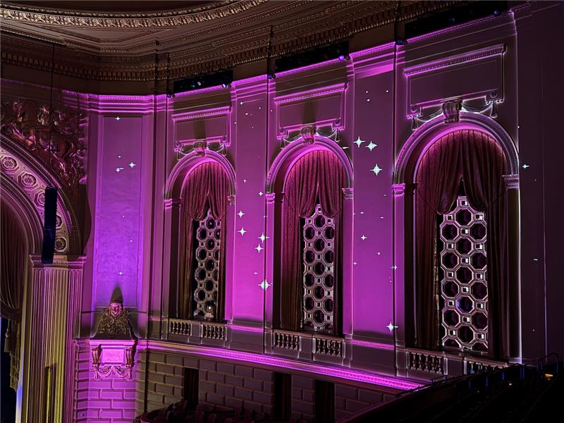
Design: Tal Rosner (projections) and Justin Partier (lighting) (Photo by: Matthew Washburn)
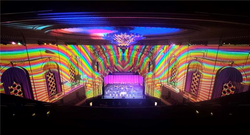
The process required to move from conception to reality of this projection mapping was a major undertaking and one requiring immense levels of technical expertise and creativity and I’m profoundly grateful to Erik for his saintly patience in working through this over the course of the last year. It not only gave Tal the canvas for stunning artistry that turned the whole opera house into a canvas for art, but it also gives us an invaluable tool moving forward.
This propels forward our technical capabilities at the Opera House, fully tied into all of our modeling systems, and we’re only just at the beginning of what could be possible with this kind of capability. We work in an extraordinary building at the War Memorial Opera House, one with some of the most beautiful detailing of any opera house in America. This stunning building now has the potential to become a part of the whole artistic and audience experience, allowing audiences to be fully immersed in a multi-sensory experience. Our inaugural Pride Concert was a wonderful way to begin that journey and I am profoundly grateful to Erik, Tal and the whole Opera team for making possible this thrilling leap into the future.
Design: Tal Rosner (projections) and Justin Partier (lighting) (Photo by: Matthew Washburn)